System Interface Workflow
01
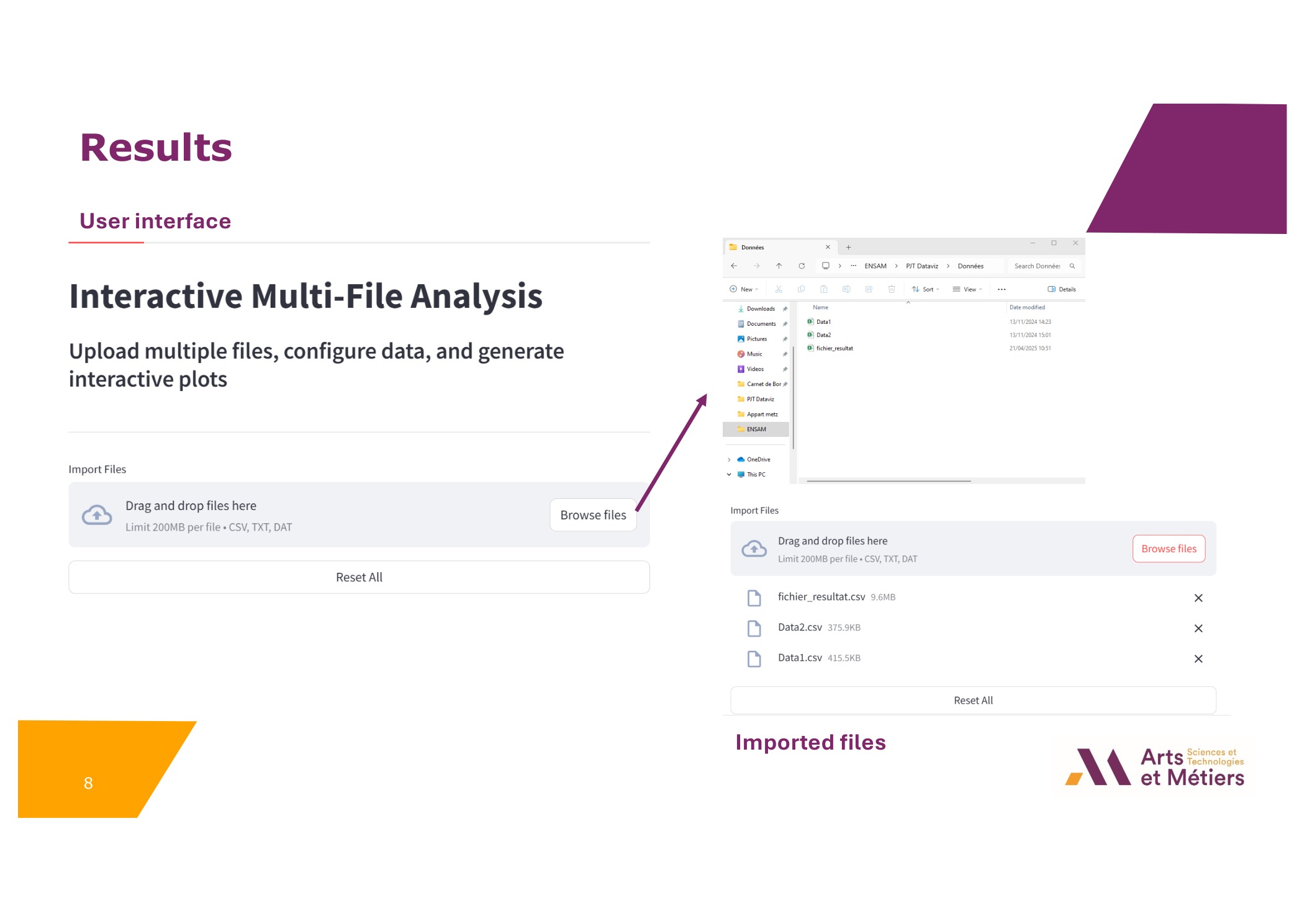
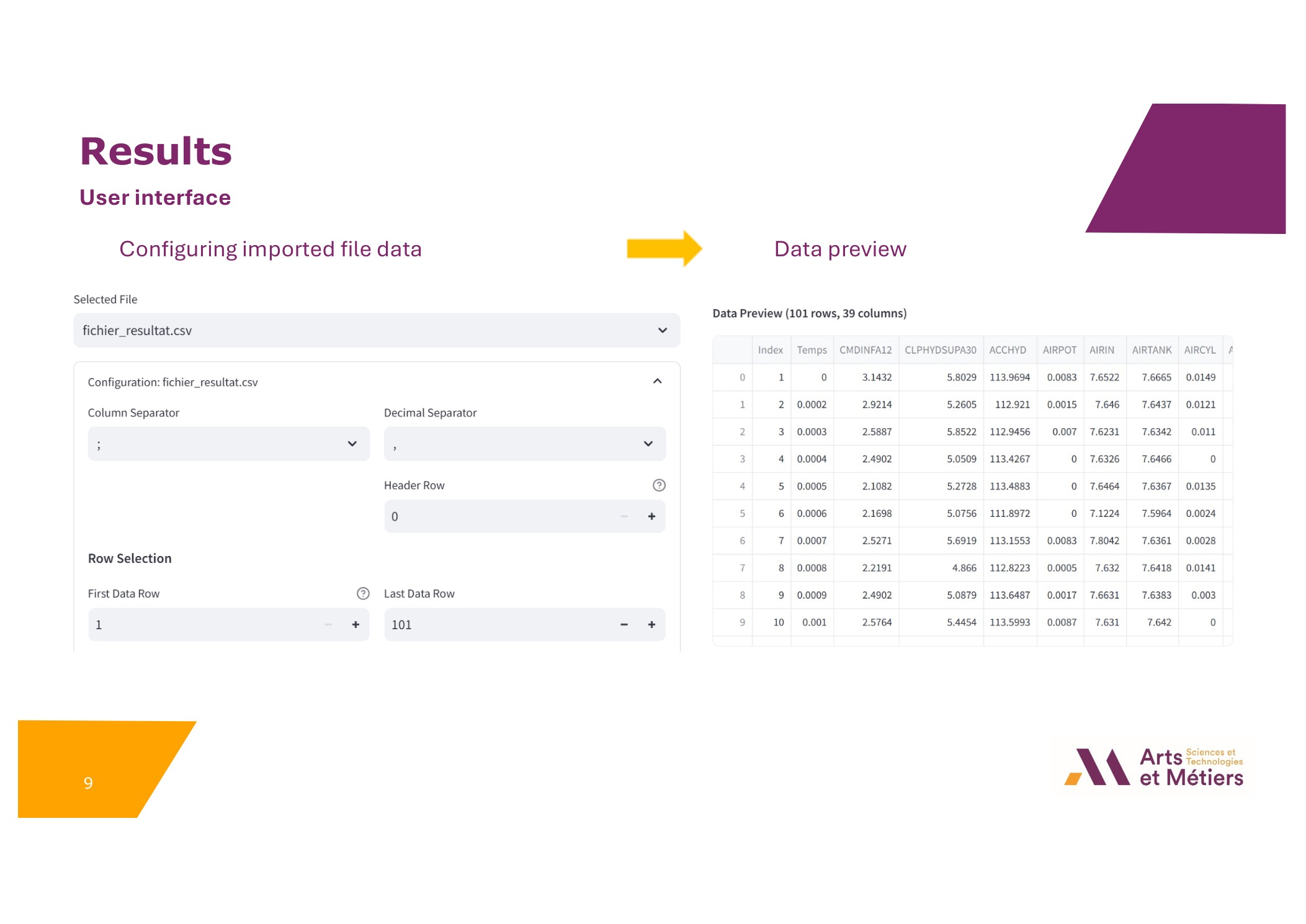
Data Ingestion
Multi-file upload supporting CSV, TXT, DAT formats with custom delimiters and header configuration.
02
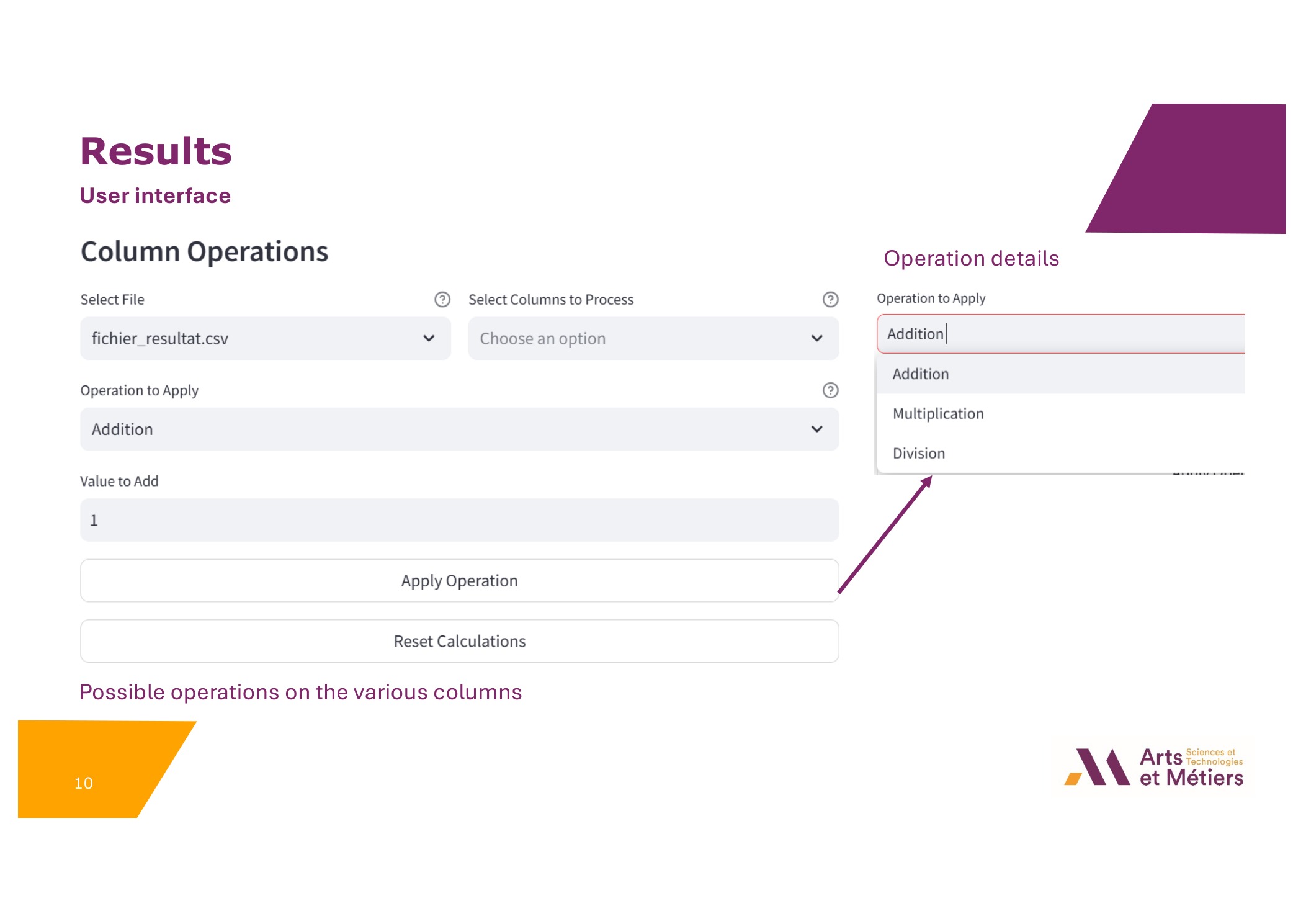
Column Operations
Apply arithmetic transformations (+, -, *, /) to specific data columns without modifying source files.
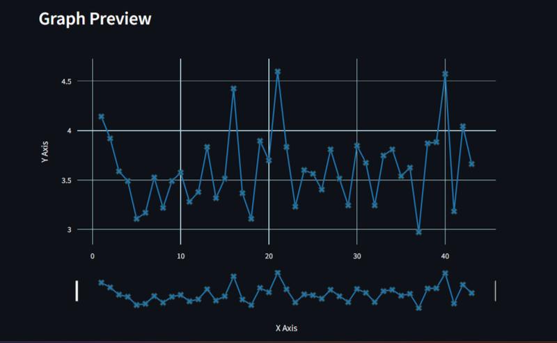
03
Graph Configuration
Dynamic selection of X/Y axes, logarithmic scales, and visual customization (colors, markers).
04
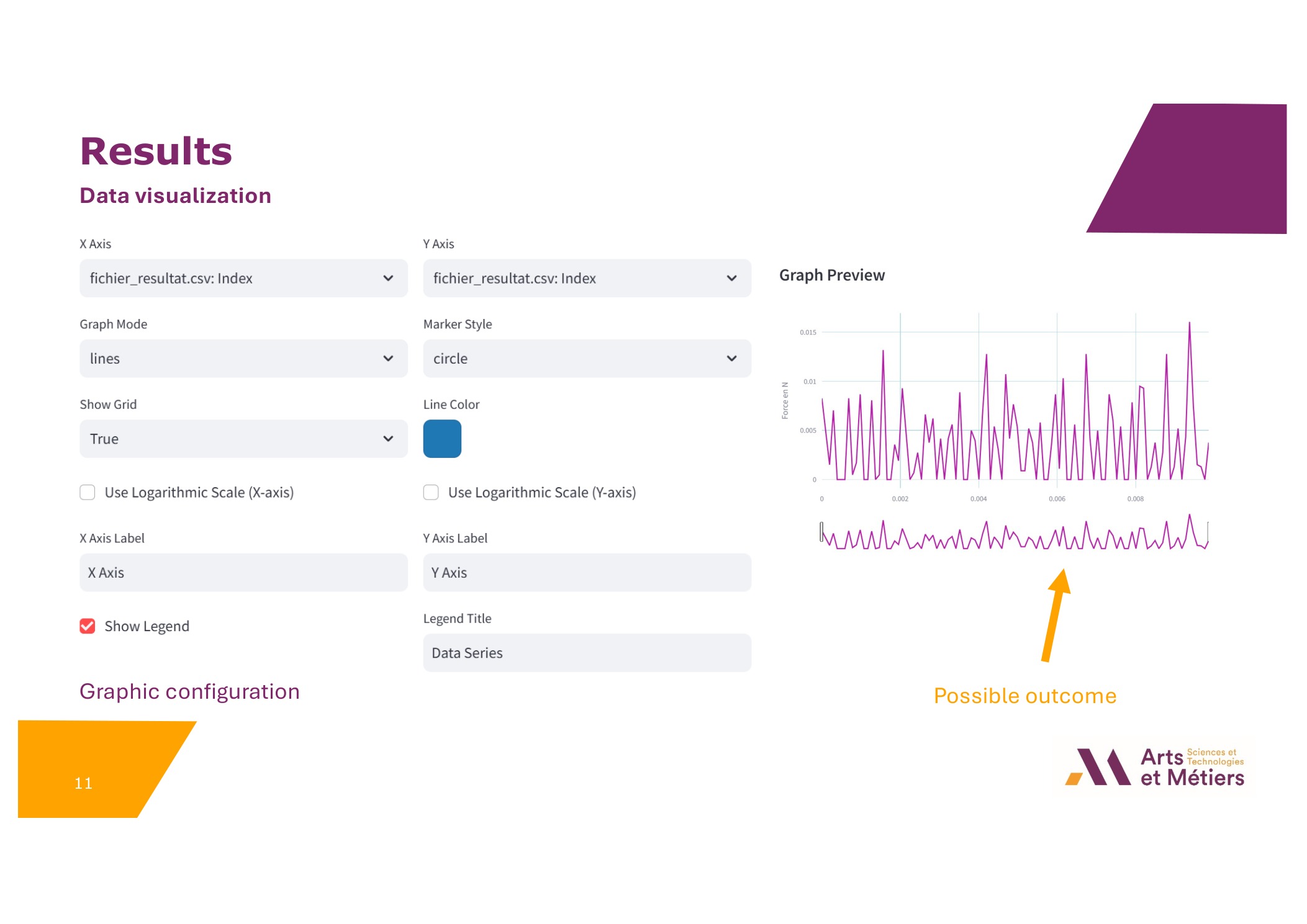
Interactive Analysis
Real-time Plotly rendering with zoom, pan, and instant export capabilities for reporting.
// ENGINEERING TEAM
Collaborative engineering effort combining skills in software development, data science, and UI/UX design.
- Thibault Halperin
- Hugo Ruault
- Killian Crenn
- William Belluot
- Elias Bouddour
- Haitam Azzal
SUPERVISOR: M. Duc-Vinh Nguyen